
by Philip S. Prince
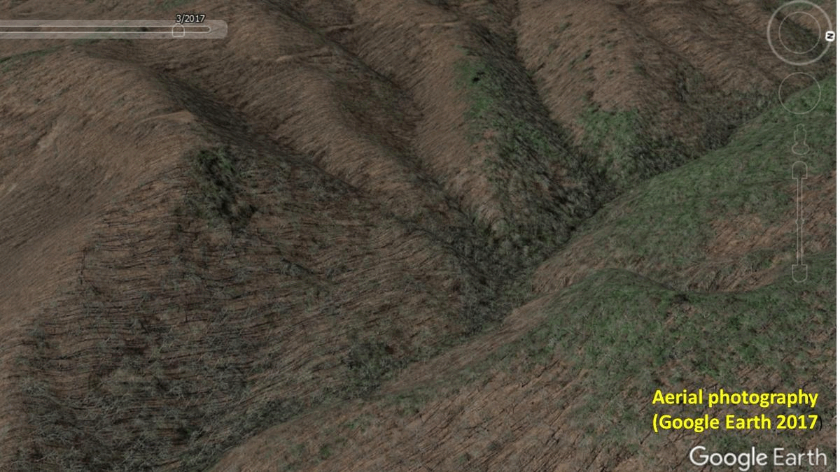
The high-quality land surface imagery that ALC currently uses for landslide mapping is generated from a lidar data set produced in 2017. This 2017 data, which has 0.5 meter (~1.6 ft) resolution, is a major improvement over the previous 2005 data, which was 6 meter (20 ft) resolution. For geologists trying to understand landslide processes, this resolution improvement is significant. The GIF below shows what enhanced lidar quality looks like by comparing Google Earth aerial photography, a 2005 lidar overlay, and then a 2017 lidar overlay. The 2017 overlay should look like putting on glasses (with the correct prescription, that is!), as it brings the land surface into crisp detail. Landslides are labeled with yellow arrows, and they are tough or impossible to see in the 2005 overlay.
Just left of the GIF’s center, a line of four arrows indicates four closely spaced slides. The slide on the right end of this group is about 100 ft (30 meters) wide, and is only marginally visible in the 2005 overlay despite its size. The 2017 overlay, of course, makes the slide (and others) clearly visible, but it goes a step farther by revealing fine details about how the sliding material traveled downslope. The image below focuses on the large, 100 ft-wide slide, and points out the “trails” of debris left on the slope by the mass of sliding material. Keep the physical size of this feature in mind–the debris trails look insignificant, but they are actually made of small boulders mixed with soil.
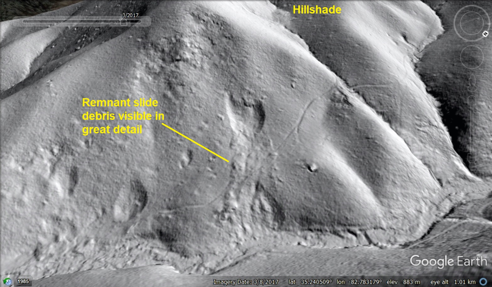
The ability to see these debris trails extending downward from the edges of the slide scar provide valuable information about movement of the slide material when the failure occurred. This was likely a single, rapid event, during which the slide material fluidized and traveled over the land surface as a sheet of boulders, trees, and mud. Material along the edges of this flowing mass lost momentum and ended up as the trails of remnant debris, while the bulk of the flow would have continued quickly to the creek near the bottom of the image. I am a big fan of using models to illustrate geologic process, and the GIF below shows a model landslide that develops similar debris trails. Note that these would not form if the mass of sliding material traveled down the model slope as an intact block. Click on the GIF to open it in a separate window and get a longer view of the final “comparison” frame.

The real slide almost certainly occurred during an extreme precipitation event, so this small model (made of sand mixed with cornmeal, with a dash of abrasive beads) omits plenty of details. The model does, however, show how faint deposits of material on the land surface can help track the direction and style of landslide debris movement. The ability to see these faint deposits with the 2017 lidar provides geologists with the opportunity to understand where slide material can end up on its course downslope. Notably, subtle debris deposits like the “trails” are, in most cases, best viewed using lidar-derived hillshade imagery, which creates a land surface image with natural-looking shadows. “Slopeshade” imagery, which brightens flat areas and darkens steep areas to create recognizable topography, reveals features in areas that hillshade can obscure, but it also reduces detail in fine debris deposits. The following two images allow a comparison of these land surface image styles.


With the new 2017 lidar, both of these imagery styles are useful-and critical-to a thorough evaluation of the landscape. Slopeshade imagery looks metallic due to its unusual distribution of light and shadow, but areas facing the artificial “sun” in hillshade imagery are too bright and washed out to see much of anything, so the two styles must be used alternately or in a transparent overlay combination. My favorite combination is a hillshade base with a 30% transparent “veil” of slopeshade on top of it. I also regularly flip back and forth between the two image styles, depending on what type of landscape detail I need to see.
So, what does all of this good data mean, beyond just being interesting to look at? Throughout western North Carolina, we can now see where slope failures happened and, if the failures produced highly mobile flows that occurred within the last 100-150 years, where the material traveled as it went downhill. Identifying areas that could potentially be reached by highly mobile, fast moving debris flow events (often called mudslides by news outlets) is essential to improving public safety by letting folks know if they may be at risk during extreme rainfall events. The slide shown in the image below provides an example of interesting overland debris flow movement that affects an unexpectedly wide area.

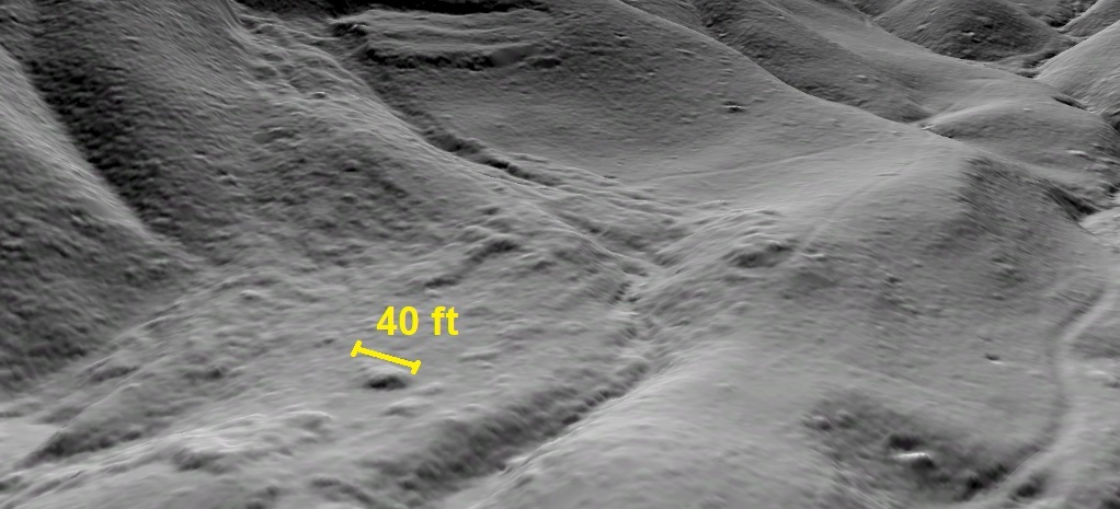
The lumpy texture of the slide debris is quite similar to the first example shown in this post, but in this case the material traveled farther and spread out onto the sloping valley floor. The spread of this material is particularly interesting, as it indicates that flow-type slides can deliver boulders, mud, and logs to broad areas of the landscape, depending on how the land surface is shaped. For a sense of scale, the rectangular slide block visible on the mountainside (it did not progress to a flow event) is about 200 feet (60 meters) across, so the debris covered area seen here is quite wide. Again, the trails of lumpy debris are actually made of boulders, and you wouldn’t want to be in their way as the material travels downslope. The detail image below shows an up-close view of the slide deposit, where its rough texture is actually registered and reproduced by the lidar elevation model. A 40 foot wide lump of bouldery debris is labeled to give a sense of the deposit’s size.
This impressive lidar-derived imagery is critical to a better understanding of what can happen in mountainous western North Carolina during extreme precipitation events. Images like the ones in this post are essential to communicating the possible results of large flow-type landslides, which are particularly dangerous due to their speed and mobility. There are plenty of these failures to be seen in the rugged landscapes of western North Carolina, and sometimes it seems like landslide mapping makes just about everywhere look risky. This isn’t the case, and it’s important to remember that there are two sides to the coin. While these images clearly show where flowing slide deposits went, they also show where the flowing material didn’t go! While these unimpacted parts of the landscape are less attention-grabbing, they represent safer choices for building and living. Being able to identify them is certainly equally valuable to helping people live and work safely in the mountains.
